
Design
This is the phase where we enter the “solution space,” where we look at how we can meet the organizational objectives and user needs that are defined in the discovery phase. Designers and system architects take the lead in design. This is when we finalize the features and functionality needed, the technical architecture of the solution. This is also where we provide a visual design concept and user workflows that will define the user experience on the website.

Designing the future.
UX/UI Design
Elements we use
Design Inspiration & Analysis 
Design inspiration and analysis kickstart the official design process, gathering client input on website vision, encompassing design elements and functionality.
Learn More About Design Inspiration & Analysis
Concept Board
A concept board is a way to visually curate creative information in order to prepare for a new project.
Learn More About Concept Board Wireframe
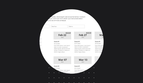
A wireframe is a visual plan of a website, allowing stakeholders to see its design and functionality before the full development process.
Learn More About Wireframe Clickable Prototype
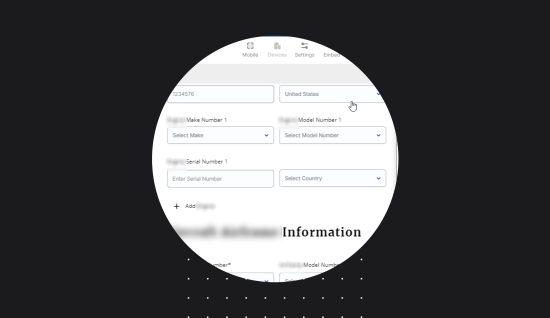
Clickable prototypes simulate user interactions, gathering feedback on UX wireframes. They aid in testing and refining the design and development process.
Learn More About Clickable Prototype Mockup
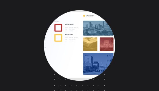
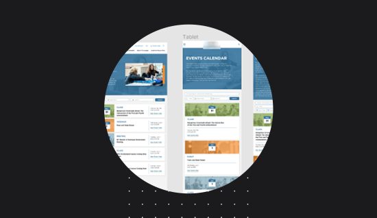
High fidelity mockups in UI design and UX branding offer a digital representation of website layouts, aiding in visualizing and refining designs.
Learn More About Mockup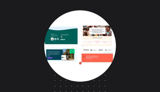
Technical Design
Elements we use
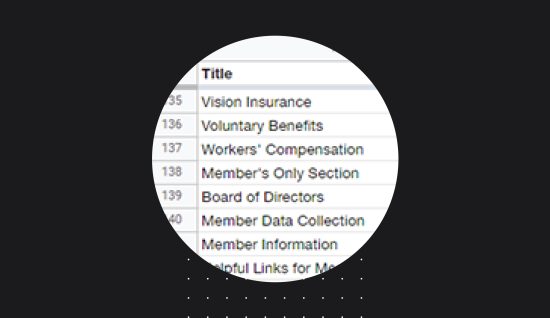
Site Structure & Mapping
Site structure and redirect mapping are two key components of website development. Site structure is the way the content and pages of a website are organized.
Learn More About Site Structure & Mapping Data Design
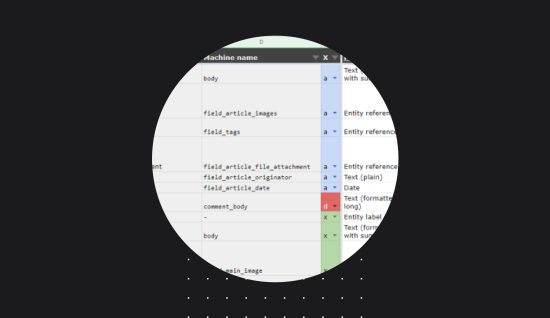
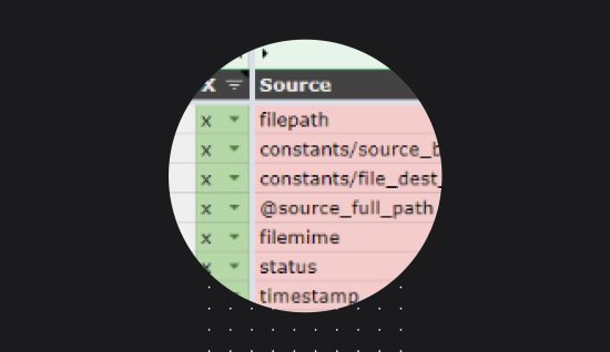
Data design is the process of creating and managing a web schema, or structure, for a website’s content and databases.
Learn More About Data Design Architecture Diagram
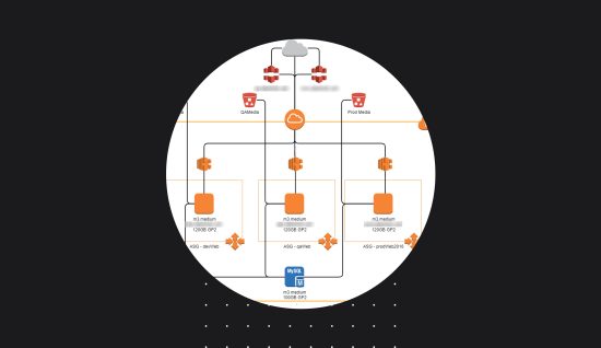
An architecture diagram is a visual representation of a system’s components and their relationships.
Learn More About Architecture Diagram Migration Planning
Migration planning involves the process of identifying, designing, and testing a plan for transitioning from one system to another.
Learn More About Migration Planning