Color – it’s one of the most expressive, subjective elements in life. Color surrounds us everywhere we go and shares a powerful connection with our emotions. And yet ironically — most of us are too blind to see just how lucky we are to have the ability to see in color. A lot of people today cannot see as many — or in some cases, any — colors like the rest of us.
It’s no surprise that our world is changing rapidly and becoming more dependent on technology. Digital experiences, such as browsing websites or applications, has become critical to our daily lives. When designing these experiences, it can be easy to overlook color accessibility.
Recently, I was asked about my design process and how I go about inclusivity – in particular with color accessibility. I realized how many people were not aware of accessible design.
So, let’s talk about color accessibility and how to go about tackling these challenges in your own digital experiences.
Why is accessibility so important?
Digital experiences can be expressive to everyone, regardless of color deficiencies. As creative professionals, we have the power to make the lives of those affected better — to have a sense of belonging. It starts with planning and designing for accessibility. It involves crafting experiences for all people, including those of us with visual, speech, auditory, physical, or cognitive disabilities. Let’s create a web we’re all proud of: an inclusive web made for and consumable by all people.
Color accessibility is important because it enables people with visual impairments or color vision deficiencies to interact with digital experiences in the same way as their non-visually-impaired counterparts.
If you have to squint at any point in a website or web app to read or articulate something, there’s an accessibility problem.
While we often think of visual impairments as long-term or permanent, many of us may experience short-term visual impairments. Have you ever had the sun glare into your eyes or your monitor when trying to browse the web or use an app? Ever forget your glasses or contacts? What about trying to read those digital billboards from a distance? Even those with the sharpest vision – corrected or not – will have trouble reading or comprehending your brand at some point.
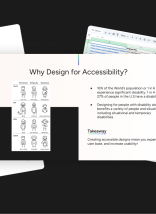
Still not convinced? In 2017, The World Health Organization estimated that roughly 217 million people live with some form of moderate to severe vision impairment. Ouch. That statistic alone is reason enough to not only consider — but mandate — design for accessibility.
Related: Get a Free Website Accessibility Audit
Apart from being an ethical best practice, there are also potential legal implications for not complying with regulatory requirements around accessibility. Did you know: In 2017, plaintiffs filed at least 814 federal lawsuits about allegedly inaccessible websites, including several class actions.
Related: A Lack of Accessibility Puts Beyonce’s Website in the Spotlight
Designing digital experiences with color accessibility in mind can also have a positive economic impact on a brand by increasing its user base and conversion rate. Similar to poor usability, poor accessibility can drive up abandonment rates, which can lead to lost revenue and ultimately lost brand value. Making sure a brand uses colors that are strong in contrast will only help improve on this economic impact.
What makes a color palette accessible?
Digital experiences should follow the guidelines outlined in the Web Content Accessibility Guidelines (WCAG) to be accessible. Color accessibility is required for Level AA and Level AAA.
Level AA
For digital experiences that must comply with WCAG 2.1 Level AA, the following are the bare minimum requirements for color contrast:
- Minimum 4.5:1 for normal text
- Minimum 3:1 for large text, graphics, and UI components (e.g. input borders)
Level AAA
For digital experiences that must comply with WCAG 2.1 Level AAA, the following are the bare minimum requirements for color contrast:
- Minimum 7:1 for normal text
- Minimum 4.5:1 for large text, graphics, and UI components (e.g. input borders)
Note — Large text refers to a minimum of 24px or 19px bold.
Ensuring your designs are color accessible doesn’t have to be difficult.
There are two types of testing for color accessibility: quantitative and qualitative. The best way to ensure your designs are accessible is to test with actual people! If someone cannot use or read your product, then there’s likely a contrast issue. Qualitative testing can be time-consuming and costly.
For inexpensive testing, there are color contrast tools you can use online. These tools measure the contrast ratio between a foreground color and background color. The higher the ratio, the more likely a person can distinguish it.
Here’s a typical scenario I go through all the time when designing digital experiences, such as websites or web applications:
- The customer provides me with their branding colors.
- I take these colors and run them through a color contrast tool to see what combinations I can use (according to the WCAG). I’ll also check brand colors against commonly-used black and white.
- When colors fail to meet the requirements, I start nudging the color’s lightness to the closest value that passes.
- Rinse and repeat
Does this sound familiar? The color palette I am given may not be the same palette I recommend. As you can imagine, it’s a difficult conversation to have with a customer that they cannot use their colors the way they want.
I’ll admit that finding elegant color combinations for Level AAA is pretty tough, but for standard body text, I almost always try to get a combination that works for that level of compliance. It’s just a better experience to have a strong contrast ratio for dense content.
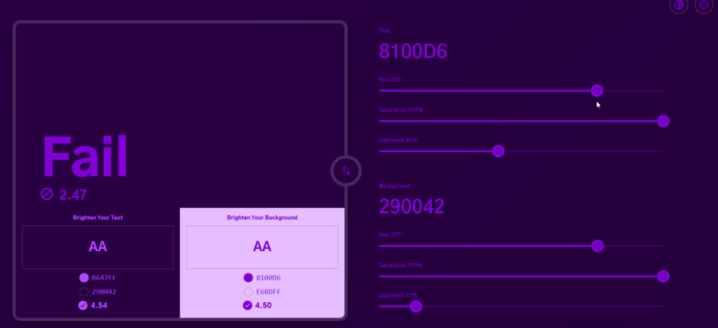
Single color contrast tool to rule them all.
To help creative professionals be better equipped, there are a lot of tools out there, such as Colorable and ColorSafe. While these tools are great at doing a simple comparison between colors, I have to manually tweak combinations that do not pass compliance. To help automate this, I designed and developed a color contrast tool, called ColorShark. I wanted ColorShark to provide people with the ability to not only provide real-time visual indicators of color combinations, their respective contrast ratios, and adjustment sliders to hue, saturation, and lightness, but also automatically detect and suggest the closest compliant colors – if your combination is not accessible.
Going back to that typical scenario, using a tool like ColorShark saves me time and budget in getting an accessible color palette for a customer and their brand. Currently, I haven’t found another tool that can provide that sense of speed and exploration.
Let’s build an accessible web.
Don’t take the ability to see color for granted. As part of inclusive design, creative professionals must promote best practices to make sure people – regardless of color deficiencies – can use websites and web applications.
Tools like ColorShark can drastically improve your exposure to color accessibility and give you the means of expanding your audience. You’ll also feel better that you’re being more inclusive!
Need help with color accessibility?
Web Accessibility Services
We designed and built ColorShark. Got an idea for a web app you’d like to make? Let’s work together.
Application Development Services