The smallest of features can negatively impact the user experience on a website if not designed properly. For example, I recently encountered a small issue in Gmail when I searched my email. The issue was very salient because I had to spend a few seconds thinking about how the feature worked…
After searching your Gmail, have you ever wanted to turn off the highlighting?
The power of search is one of the things that makes Gmail one of the best email solutions available.
Have you ever searched for an email (using a keyword) and noticed that the keywords you used were highlighted in the resulting email? This feature is very useful and mimics traditional search engine behavior, where keywords are bolded in a couple sentences from each result.
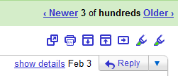
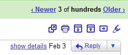
The highlighting can actually be controlled by using the two icons that appear in the top-right of the search results page:

Unfortunately, these icons are identical, so the user has no idea which one to click. The left highlighter icon will actually turn on highlighting (only if it’s off), and the right highlighter icon will turn off highlighting (only if it’s on). The design is very salient because it doesn’t match the user’s mental model, which is primarily developed from previous experience (with computers and in the real-world).
Here’s a design that should match a user’s mental model, because it’s very similar to an on/off button:
On:

Off:

Little Big Details
This may seem like a very small issue, but imagine how many people must have encountered it. Small details like this should not be overlooked. The blog Little Big Details does a great job at demonstrating how small features can make a big difference. One of my favorite posts was their demonstration that the position of the close button stays the same in Chrome, allowing users to effortlessly close more than one tab. Small details like that go unnoticed by the majority of users, which is actually a good thing. When users have a frustration-free experience, they can focus more on their goals (which is why they’re on the site in the first place!).


