Like many holiday travelers this past December, I was recently reminded that nature was really in charge of my family’s holiday travel plans. Nature has blizzards. All I have is a GPS and a snow brush.
Not one to panic, I quickly turned to the internet to solve my problems.

I fired up my mobile device in an attempt to find an affordable hotel room. Why slip and slide in the snow when my family and I can order pizza and wait warmly while it all passes by?
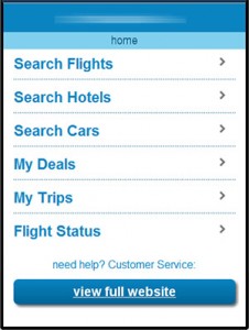
The hotel finding experience started off well enough – I went to a name brand discount travel website and found they had a mobile-formatted home page. This allowed me to quickly search for and find a hotel room nearby. The site’s layout was great and the menu options helped me narrow things down quickly and efficiently. It let me view features, reviews, and see estimated prices of the hotels I was considering. This is the sort of top-notch mobile user experience we all want, especially when a blizzard is coming.
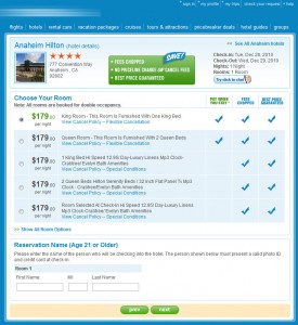
Then, when I went to purchase the hotel room, I received what mobile web users have come to dread – the mobile-to-desktop hand-off.
We’ve all experienced it. It’s that one link tap that, without any warning or context, takes you straight to a traditional full-width desktop website. Now I’m sliding, re-sizing, tilting, and zooming the screen to find the links and buttons I’m looking for.
Sure, my iPod Touch browser handles it in stride, but if I was using my pay-as-you-go-low-tech phone browser, things would have been a great deal more painful, if not impossible.

This story has a happy ending. I was able to book the hotel room at a reasonable price and ensure my family was happy and warm while we waited for the snow to pass – but I was left with a bad vibe about the travel company. Not because I had to use a non-mobile website to reserve the room (not everyone had a budget for a dedicated mobile site) but because I was, without warning, passed off to a non-mobile website right as I was able to complete the transaction. Right when I was pulling out my wallet.
Why tease your users with a great initial experience and then bring in someone else to close the sale? And why do it right before I put my credit card information in? Why push confusion before the conversion?
This is why great online experience are often the result of user testing an entire process, not just an initial screen or menu design. Shocking layout and interaction transitions should not be part of your plan. Why leave your users out in the cold?


