He calculated $400M since our start all those years ago (1999 for me, some at the table before that). One FOM (Friend of Martin) runs a company specializing in ecommerce sites between $5M and $50M. He had the lion’s share of the money made online, but everyone at the table had millions in sales to their credit.
At $30M over 7 years I was the “baby” merchant at the table. I’d earned my way in by being a good student, and I was buying lunch in downtown Raleigh (lol). Since I was paying, I challenged my friends to agree on five things “e-commerce pros” look for when reviewing web design. Before I share these 5 “how to look at ecommerce websites like an ecomm pro” tips, it is important to know the backgrounds at the table:
- Programmer / entrepreneur running a company controlling a little over $30M annually in a wide range of retail sites across several business verticals ( not Atlantic BT ).
- Designer, entrepreneur and branding expert who has worked with Fortune 100 clients creating identity and every nature of campaigns whose graphic designs you’ve probably seen without knowing it.
- Entrepreneur who was one of the first to explain social media marketing to me long before anyone knew what such a thing was, now working in B2B.
- Friend and former designer who was now running a massive ecomm niche site, doing a little under $6M in online B2C transactions, and who was getting ready for another busy season.
- And Me, former Director of Ecommerce running a site my team built to $6M annually generating over $30M topline over 7 years, and I was the “baby” at this lunch.
Here are the tips we came up with for how and why we look at websites:
- Brand, Tag and Contact.
- Golden Triangle.
- People and Lines of Sight.
- Calls to action.
- Nonverbals (mine).
Brand, Tag and Contact
Brands, once established, are shorthand for larger messages and emotional connections. Prior to a brand owning a position in your brain, brands must be explained and understood in order to create the shorthand. The ideal brand interaction, my “branding” expert friend explained, is an ever tightening spiral loop.
“Ideally you get more and more meaning with less and less interaction,” my friend shared. The idea is to drip water into a crack, let it freeze and widen the crack over and over until the crack is won over. We don’t play for cracks in cement, my friend explained, we play for hearts and minds, but the process is similar. Create more and more connection with less and less exposure, interaction, overhead and cost.
One of the important and easy to get wrong ideas is an easy way to contact without the web. “Few use the physical address or the 1-800 anymore, but having information that doesn’t require a computer to access makes computer users more trusting,” my programmer / entrepreneur friend shared.
Golden Triangle of Website Design
In western culture we read from left to right. It isn’t hard to understand why the most powerful portion of a webpage is the upper left. Eyes rest in the upper left for longer periods and they start there, so guide them well. Guide eyes and minds with images, text and calls to action.
People and Lines of Sight
I’ve written about the importance of people in web design (People Not Things Sell), and my friend brought this article up. He was the inspiration for my post, so he likes to remind me (lol). He is the champion of using people in web design. He sees people as the most important way to warm up web design, encourage conversion and get new visitors comfortable with a website fast. He has specific rules about how he uses people, such as avoiding stock photography.
His sites use stock sometimes, but they use stock in some unique way (by changing angles, filters or combining with other imagery). His great designers share something with Atlantic BT’s web designers. Both know how to blend stock into web design so it doesn’t feel so Stock photography-like. We all agreed this was a mission critical skill, since stock is FAST and therefore CHEAP, but stock photography should be used like a loaded gun (carefully).
Calls to Action
When people come into a new site, they want to know two things. They want to know if they are in the right place (called “Scent Trail”). Next, they want to know what YOU, the wizard behind the curtain and the website designer, want THEM to do. If your site is unclear, hard to find the answer to either of those questions, then you, your company, brands and products are seen as confusing and not a website visitors want to buy from.
Website Design Nonverbals
When a site is a clean, well-lit place, it helps visitors feel comfortable and trusting. We look for certain clues and meaning to know if we can trust a website. These judgments are made in the time it takes to blink three times, and they may last forever.
Next, I challenged my friends to comment on some example websites, shared as plates were cleared. I pulled up a few examples from a recent Scoop.it post: 30 Excellent Website Layouts, via Flashuser.net. Here is the design that got the most energy and response:
1. GeoTime5
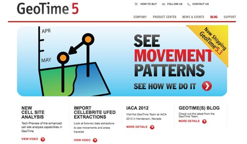
The energy on this design was around more clear communication about the 5 W’s (What, Who, When, Why, Where). The lack of both a brand tag (usually put directly below the brand name in the upper left) and a creation story hurt the design. “The site assumes I know more than I do,” my designer friend said. The other Internet marketers at the table agreed that GeoTime5 needed to explain what they do and who they are, better and faster.
They should move the ‘see movement patterns’ tag under the logo to create a relationship to the name. Proximity is a constant theme with these guys. They hate it when someone breaks proximity rules. I shared my recent Ecommerce Audit Post featuring high-end ear buds manufacturer Etymotic. On the Etymotic site, the brand tag was right justified and so far away from their name, not unlike GeoTime5. One of my friends pulled up my Ecommerce Audit post on his iPad and sent his iPad around the table.
“The location of GeoTime5’s tag in a ‘hero’ position is confusing and creates ‘cross talk’.” My friend went on to explain that “cross talk” in this context meant that the brand’s message, “see movement patterns”, didn’t help much, since it is located in a position where offers are traditionally made. He did like that there was a call to action in the hero, but here was his take on the language: “Saying ‘see how we do it’ is not the point. The real POINT is to see how customers use and love GeoTime5. We know the team at GeoTime5 loves it. The real question is, how does everyone else feel about GeoTime5?”
The best way to sell ideas to customers is to NOT “sell” yourself. Use specific, tagged and non-anonymous testimonials, tweets, reviews or other sources of legitimacy curated from the social web about how your company is impacting the world. When your customers SAY you are great, THEY are believable.
We Internet marketers can speak to our vision and values but not how anything we do is great or good. “So we get to speak to aspirations and facts but not to recommendations or suggestions?” I asked. The table agreed, some lines can be crossed. One of our roles as Internet marketers is sharing opinions grounded in expertise and appreciated by the mob, so clearly identified “Staff Reviews” is one of the favorite “selling” content almost everyone at the table uses. “Clearly labeled Staff Reviews can’t be the only review on the page, or it looks like you are trying to sell again,” my designer friend pointed out. He doesn’t bring in staff reviews until there are at least 5 reviews on the page and a sense of the product already being formed by those reviews.
GeoTime5’s tiny Calls to Action saying, “view video”, got the ire of our keyword SEO specialist and the designer. The SEO expert wanted more keywords in the CTAs. The designer wanted a big orange or red button with the ability to do an A/B test against a blue button.
I chimed in to ask, “Where is the site’s story? Where are the founder’s sweat, hopes and dreams? Where were small children looking up to their father asking about movement patterns?” A half eaten roll was thrown at my head as I finished that statement (lol), but my friends agreed that the site was thin, confusing and not very welcoming or engaging. Finally another friend suggested I send my post about People Not Things Sell to the company (something I would never do, and he knew it). The person making that suggestion was who taught me about people as design elements, so he was really complimenting himself (I pointed that out too, LOL).
Geotime5 didn’t set the hook very well, the table decided. They might have a great product, but we weren’t intrigued enough to do the work to find out. “Like all sites, they have two choices,” my designer friend said, “They make it EASY to learn, or they plant the emotional hook deep enough I MUST learn.” The consensus was GeoTime5 did neither.
“Don’t even get me started on their SEO,” my Google Panda and Penguin expert friend said, dismissing the site completely. I pressed, asking what he meant. “The title is keyword weak, there are no keywords in the CTAs, and the CTA setups are keyword weak too. And I can say that without having done one hour of research,” my friend noted, and that is where we left GeoTime5.
Since most of the table spend most of their time working on and creating ecommerce websites I asked about favorites. REI was on everyone’s list:
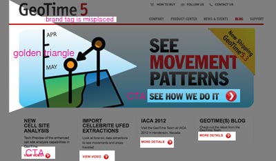
Well designed heroes, great uses of people and line of sight (where people look at the call to action you want visitors to do). Another friend noted how they used video. “I love the small video box inside the hero,” he said. Video is so powerful, it gets so many clicks, and REI doesn’t oversell it. Subtle but powerful was the consensus view on the party visual.
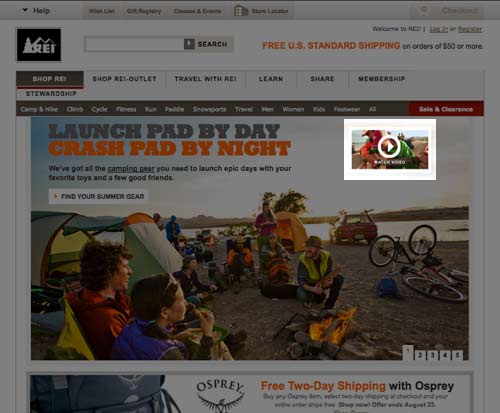
Everyone’s favorite of the rotating front page images was the runner (see below). “There are two brilliant intertwined triangles here,” my designer friend pointed out. The first triangle is the famous golden triangle that starts upper left and extends into the body of the hero (hero is web designer speak for largest image on a page).
“Note how the golden triangle in the runner image takes your eyes to the runner and then directly to the Call to Action,” my designer friend said, drawing on my screen with a toothpick. The murmurs of approval told me my ecommerce friends had great respect for such a clean jump to the main point of the page – promote the click. Another friend pointed out my Amy Africa notes from the conversion conference. “It was great to hear a researcher confirm what we believe and have tested,” my friend said, meaning the way he uses people to look at CTA’s or straight out at the visitor to increase engagement. Lest you think my friends read my posts all the time, they do NOT (lol), but this friend was scheduled to go to Conversion Conference in Chicago with me and had to stay home and attend to an emergency on one of his websites instead. He was the reason I liveblogged the conference.
He went on to explain that his take on the REI runner page was, yes her view was directly into the “Maximize Your Fun on the Run” headline, but her eyes are also directed out toward their red sale button. “The right is a real gutter ball area,” my friend said, “We have trouble getting any clicks out of the right side of the page.” He went on to explain the gymnastics necessary to get eyeballs to the right side of the page with the one exception – an ecommerce site. “Your note about people’s eyes going immediately up and to the right in an ecommerce site is why we ALL have cart icons there,” he pointed out (as does REI).
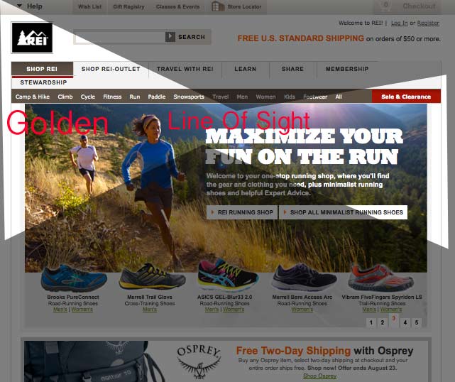
The cart icon in the upper right is a form of scent trail, a confirming signal. Same friend pointed out the large Free Shipping, with a price trigger, believing that information was bold enough that even if it wasn’t in the direct line of site, it would be seen and noted in the visitor’s peripheral vision.
I chimed in with how the clean lines, fun outdoor scenes and action created great nonverbals. The site is selling its benefits, making it clear that they can be trusted and are a fun, well-lit place. Another roll was thrown at my head as I paid the bill and thanked my friends for tossing things at me and sharing their expertise.
Join Our Internet Marketing Tribe
If you would like to join our tribe of Internet marketers, please…
Follow @AtlanticBT
Like Atlantic Business Technologies on Facebook
Follow Marty @ScentTrial


