The simpler the website design, the easier it is to use. The more functionality a website has, the more useful it can be. With website design and development, the focus needs to be on maintaining a balance between usability and functionality to maximize user satisfaction.
People need to have access to features that help them complete tasks, but they also have to be able to easily find these features. Plus, they need to be able to comprehend how to use them.
What makes a website usable?
A usable website has a simple experience. It’s easy for people to find necessary information, complete tasks, and learn how to use features.
What makes a website functional?
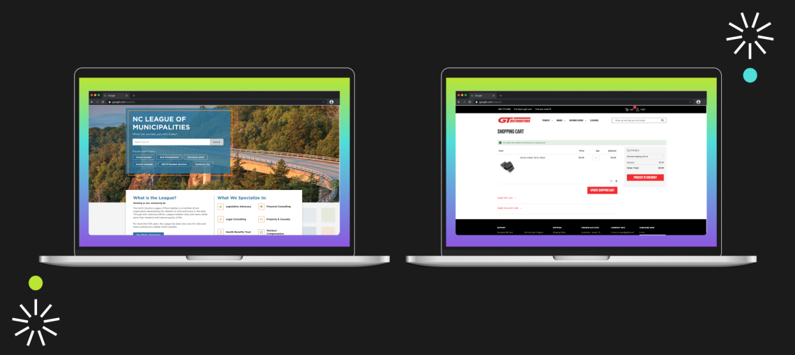
A functional website has many operational features. Maybe users can add items to a favorites list, get a price quote from a calculator, make online purchases, or filter through content with search.
Achieving a usability and functionality balance pays off in website design and development.
If you can find a way to hit the sweet spot of balancing functionality with usability, you’ll reap the rewards. Crafting a this sort of experience with website design and development means:
- Increased customer satisfaction
- More online conversions
- Boosted brand loyalty and positive word of mouth
- Reducing frustration that leads to poor word of mouth or people calling support
Why do people clash over functionality and usability?
Usability and functionality can be considered a tradeoff in website design and development. It’s not easy to design a website to perform complex tasks while being simple enough for its intended users to handle.
You’ll have to face tough questions like: Are some features taking away from others? Are they cluttering the website? Can people find the feature they need? Can the average visitor use the feature easily?
Usually, designers will push back on stakeholders during this step. While a stakeholder wants to add as much functionality as possible to pages, a web designer needs to remind them that if everything is urgent, nothing is urgent. It’s a team effort to optimally prioritize elements of a page.
Testing is an essential step in website design and development.
Good UX is not about adding more features/options. It’s about improving interactions based on how a user wants and needs to engage with the system.
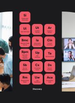
But how do you know what the user wants to start with? Most businesses incorporate a discovery step before development. At Atlantic BT, this phase includes UX workshops where we map tasks a user would perform on the site, interview or survey for more information, gather additional website requirements, and determine Information Architecture.
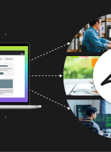
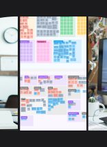
However, after Discovery, the best way to ensure a website is satisfactory is to test a prototype. You need to test what a user will actually do in a scenario (not just what they say they’ll do). For large projects, Atlantic BT tests prototypes of a research-based design to monitor usability before a launch.
Research, design, and testing can feel overwhelming.
Handling large website design and development projects in-house can feel overwhelming. Atlantic BT can help. Our streamlined process includes the careful research, requirements gathering, and testing needed for successful launches. Reach out for a free consultation.