Ecommerce Conversion Paradox
Most websites convert between 2% and 5% of their traffic. Ecommerce 3.0 is going to be about the art and science involved in converting visitors to buyers. Since sending more traffic to a low-converting website is a waste of time and money, Conversion Audits are a great place to start creating Ecommerce 3.0 websites that really convert.
Ecommerce Conversion Audit
There are three dimensions involved in an ecommerce audit:
- Design
- Calls To Action
- Forms or other points of conversion
This post demonstrates how to conduct an ecommerce conversion design audit.
Ecommerce Conversion Audit: Design
Never change anything on an existing website without testing. First rule of web design and Internet marketing is DO NO HARM. Some lousy-looking designs convert, so don’t change anything without conducting at least an A/B test.
You need to know where to start testing. Grade your website’s design for each of these criteria:
- Occam’s Razor – less is more.
- Golden Triangle – upper left is a hot zone.
- Image Blocking – images change visitor paths.
- Copy – less is more, tease the click.
- Navigation – scent trail, am I in the right place?
- Non-verbals – how does site’s approach reflect business values?
Etymotic Conversion Case Study
It is easier to show ecommerce best practices than to fully explain. Etymotic makes high end ear buds. I don’t have a relationship with Etymotic other than as a customer. Here is their current home page (the main image rotates):
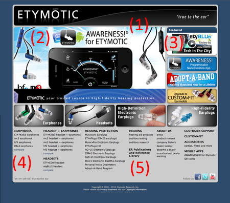
- Occam’s Razor: D-
- Golden Triangle: F
- Image Blocking: D
- Copy: D+
- Navigation: D
- Non-verbals: F
Etymotic Homepage Conversion Grade: D-
Occam’s Razor: D-
Etymotic’s home page has too much going on. There is no clear hierarchy. Customers want to know where we, as website designers, want them to go. Etymotic makes a common mistake in their site design. Putting more options on the page creates the impression of choice while depressing real choice.
How does that happen? Ironically, choice is depressed by too many options, as explained in Barry Schwartz excellent book: Paradox of Choice: Why more is less. Too many options makes visitors uncomfortable with making any choice. The ironic implication is that when we load too many choices into a page, we decrease the actual choices our visitors will make.
After 12 years in ecommerce, creating multiple sites and auditing hundreds, I’ve never seen a site where 5% to 10% of the links didn’t capture 90% of the traffic. Another way of thinking about this is that 20% of any page’s links get 80% or more of the clicks. Most web pages address the needs of designers and marketers more than visitors. Visitors want clear communication about what they should do next, and Etymotic’s current homepage fails this test.
Golden Triangle: F
Western cultures read left to right, so most visitors’ eyes will go and spend the most time on the upper left of a page. Powerful calls to action, navigation and other important information should be in any ecommerce site’s upper left area. Etymotic only has their name in the upper left. It is important to confirm the user’s “information scent trail” by answering the question, “Am I where I want to be?” So Etymotic gets some credit, but the area is so valuable that it is a shame they don’t do more with it.
Etymotic’s homepage has two other big issues. They separate their brand tagline from the logo in an odd and dislocating way by locating “true to the ear” all the way to the right, making it float alone and breaking the connection to the brand’s logo.
Ecommerce sites have another requirement. They must immediately identify themselves as a site where products can be purchased. Studies presented by Amy Africa at the Conversion Conference in June explained how eye tracking shows that visitors to ecommerce sites move their eyes to the upper right.
The upper right is a conventional place to locate a “permanent cart”. Permanent carts are based on cookies. They keep track of any merchandise put in them over multiple visits. The lack of a cart icon in the upper right makes Etymotic look like a manufacturer’s brochureware site and NOT an ecommerce website.
Finally, Etymotic’s choice to locate their navigation in cluster text links in the page’s lower third is a very confusing signal for visitors. The most important thing for a visitor, after they are sure of being in the right place, is to clearly answer the, “What do I do next?” question. Etymotic presents so many navigational options it reduces choice, creating a Schwartzian paradox of choice. Even more damaging than depressing response is confusing it. Locating navigational elements in the page’s lower third, instead of top horizontal or aligned left, breaks website design convention and not in a good way.
The lack of rich calls to action, navigation or other helpful information in Etymotic’s golden triangle, the separation of its brand tag from their name, the lack of a shopping cart in the upper right, and the location of the navigation in a non-traditional location means Etymotic’s homepage fails the Golden Triangle test.
Image Blocking: D
Etymotic does use images to move visitor eyes from the left to the right. They get our eyes to go where they want them, but then the image at the top of their confusing jumble of offers, campaigns and information is a video with the screen capture’s image line of eyesight looking further off the page. Had us and then lost us.
This area area to the right of Etymotic’s “hero” (a hero is the largest image on any webpage) is a conversion disaster:
Video Note
Online video is very powerful. Any video gets lots of clicks, but those clicks can lower conversion. The little video play button, the round circle with the triangle, is a powerful implied Call To Action. Don’t feel like you have to use a bad image because it is a screen capture. Use a great image with the video play button, and then start the player on a click. Video screen captures always look bad, as does Etymotic’s, so don’t use them.
I like to place videos in places where people have to work a little to find them (trust me, they will). The rest of this stack of ads is confusing and distracting. Confusion is being created by the design. There are too many fonts, colors and messages for any visitor to parse, understand or act upon.
People Note
Pictures of people can help or hurt conversion. Generally, including people in an ecommerce design is a good idea. People warm a site up and create a sense of, “They are like me!” that can help conversion. Here is Martin’s Guide to Using People in Ecommere for Maximum Conversion:
- Line of eyesight – people look where people in pictures on a website are looking.
- Looking Out At Visitors Increases Engagement.
- People in pictures looking at a Call-To-Action increases conversion.
- Babies must be looked at, but the same line of eyesight rules apply.
- Emotional Mirroring – we mirror the emotions people in pictures show.
- Situational Mirroring – we place ourselves in the situation in a website’s pictures in our imagination.
- Danger Principle – a little danger goes a long way to increasing engagement and conversion; too much danger decreases conversion.
- Movement Principle – eyes track movement, but movement must be ruled “benign” and non-threatening, so too much movement too fast keeps visitors agitated, reducing conversions.
Copy: D+
Etymotic shouts a flurry of messages without a unifying theme or storyline. They have sales, customer products and causes all blended together in an ill-planned stew of shouting. Having multiple ideas is fine, but unifying them with color and/or theme increases conversion.
Navigation: D
In a strange way, Etymotic is nothing other than navigation. Since the site doesn’t tell the story of these wonderful earphones, it falls back on the idea that presenting more choice provides more choice, when we know from Schwartz’s research such an overload decreases conversion. The worst choice is ignoring best practices and current convention to place a jumbled navigation in the page’s lower third. The place of the official navigation in such a lowly space sends a, “This is not important,” message.
Non-Verbals: F
I’ve pioneered an idea about website design nonverbal communication for years. The idea is simple. Just as humans communicate most of their information in nonverbal signals, so do websites. Websites send nonverbal clues, such as complicated vs. simple, expensive vs. cheap, advanced vs. beginner, and men vs. women, many times without realizing that their secret natures are fully exposed in the way they do things.
Etymotic exposes its engineering roots. Only engineers could look at, approve and want the jumble that is their homepage. No one can be good at everything. Etymotic’s gifted engineers need a better web design partnership to let the high end and very special nature of their product come out.
The most important nonverbal message is to align with the values of the company. Etmotic’s values are about creating innovative technology that sounds amazing. Its homepage doesn’t consistently communicate their brand values in its non-verbal communication.
Fixing Etymotic’s Homepage
I’m not a graphic designer, but I like to use Photoshop to rough ideas out for graphic designers. Keep in mind that the images below are rough and created only to provide macro ideas, not meant to solve the problem as a pro graphic designer would.
Here is an Etymotic homepage design guaranteed to convert better than their current design. If I could do anything I wanted, I would change even this design another 20%, but it is rare to be able to completely break a design and start fresh. The re-design below would be acceptable, as it builds on what is there while correcting obvious conversion issues:
Martin’s Conversion Notes
Occam’s Razor
This design makes progress in quieting the site’s chaos and aligning with Etymotic’s higher end customers. The old site wasn’t cool, and that is a problem, since cool is what they are selling. Here is how this proposed homepage design helps Occam’s Razor issues:
- Reduced choices slightly but mostly just colored and styled choices to quiet the riot of selection options.
- Fixed brand and brand tag dislocation and found a cool use of negative space by placing “true to the ear” in the C (see example below).
- United the banners to the right of the hero and picked the “save the band” theme as the unifying theme.
Golden Triangle
Didn’t fix as much in the golden triangle as I would have wanted, but created enough difference to test and see if the redesign is moving in the right direction:
- Put permanent cart on right.
- Moved brand tag over to be part of main logo.
Image Blocking
I didn’t change much of the actual image mapping, but I weeded out the garden and made it clear, with the move of the hero looking directly to screen right, where I want visitor eyes to move.
Copy
I didn’t tackle the copy issue. I would want to add more personality via a story about creation, sharing company values and customer testimonials. Normally I would have pull quote images going into a testimonial landing page. Here I decided to pull in the twitter feed (right side, lower third). Tweeter feeds can be a form of near real time reviews.
The Twitter feed also keeps the page pinging with updated content if it is programmed in carefully. Having pages that update frequently is important to the new post-Panda and Penguin SEO. Not sure if Twitter can carry review, testimonial and update ping frequency load (seems like a lot to ask), but not a bad place to start.
Navigation and Non-verbals
The navigation issues need further work, thinking and testing, but the site’s non-verbals feel more consistent with the brand.
Ecommerce Conversion Audit Summary
This audit covers one of the three elements of a Conversion Audit – Design. Will follow with posts on Calls-To-Action and Forms next.
Marty
Related Posts
Conversion Conference Live Blog – Amy Africa
Conversion Conference Live Blog – Keynote and Day One
Join Our Internet Marketing Tribe
If you would like to join our tribe of Internet marketers, please…
Follow @AtlanticBT
Like Atlantic Business Technologies on Facebook
Follow Marty @ScentTrial


