Internet users have little patience when browsing websites.
More often than not, users are on a mission and are determined to find specific information. You [as a company] get one chance to impress your targeted audience with your design. Based off of previous studies, users can judge your website in as little as 50 milliseconds!
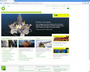
Most designers would think that they should focus solely on the home page design, thinking that the users would go there first. On the contrary, users could possibly land on any of the pages in your website through search engines or outside links from blog posts, emails, websites or more.
A research team lead by Dr. Gitte Lindgaard found that people can make rough decisions about a Web page’s visual appeal after being exposed to it for as little as 50 ms. In her study, she had participants judge websites that were flashed on a computer screen for 0.05 seconds. It is worth noting that most users don’t actually browse the web in this same manner; however, it informs us that users can make decisions rather quickly. Most eye tracking studies show that the human eye can quickly skim over a page. It is almost a general rule of thumb in usability that all Internet users browse or scan websites, not read them. This directly elevates the importance of content usability.
0.1 second is the response time limit if you want users to feel like their actions are directly causing something to happen on the screen. For example, if you click on an expandable menu and see the expanded version in less than 0.1 seconds, then it feels as if you made the menu open up. If it takes longer than 0.1 seconds for the revised state to appear, then the response doesn’t feel “instantaneous” — instead, it feels as if the computer is doing something to make the menu open.
Thus, to create the illusion of direct manipulation, a user interface must be faster than 0.1 second.
Jakob Nielsen
Judge Me in a Heartbeat!
First impressions are critical to keeping a user curious about a website. Chances are that if you don’t make a good first impression, you’ll lose them permanently. Websites that use enhanced usability strategies are more likely to keep the user from bouncing. Some of these strategies include:
Don’t Make Me Think
As a rule, people don’t like to puzzle over how to do things. If people who build a site don’t care enough to make things obvious it can erode confidence in the site and its publishers.
Don’t lose search
Some people (search-dominant users), will almost always look for a search box as they enter a site. These may be the same people who look for the nearest clerk as soon as they enter a store. This can be an exception to small sites with very 1-2 levels of structure.
Make it easy to go home
Having a home button in sight at all times offers reassurance that no matter how lost I may get, I can always start over, like pressing a Reset button or using a “Get out of Jail free” card.
While it may be hard to judge anything in as little as 50ms, the key fact is that people can be hooked or discouraged by a website’s design and content rapidly. It is always good practice to test your site designs for usability and see what participants think of the site. It only takes a handful of people to determine distinct patterns on what is right or wrong.
So let’s hear from you. Let us know your experiences when browsing a website for the first time.