For those in the know, the difference between check boxes and radio buttons seem obvious. Check boxes are for a variety of selections. Radio buttons are for agreed upon exclusive options. It is usually easy to select the proper web form element, but it can get tricky in some situations.

History of the Radio Button
Let’s review how radio buttons came to be.
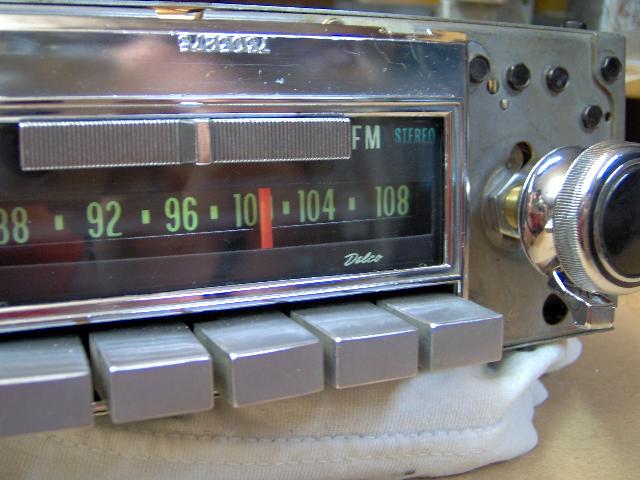
Once upon a time, graphical user interface elements were being developed. During this time of innovation, metaphors were often used for icons and actions. For example, an icon with scissors was for the Cut action and a home icon was for a Homepage. Tim Berners-Lee and Dan Connolly were the first to define radio buttons, as well as checkboxes. At the time, car radios most often had buttons for presets, where a person could only press one button down at a time.
Young web designers may not recognize the metaphor. Most modern car radios have preset buttons that do not depress. Some people think that the term came from “radius” or “radial”. Ah, youth. The good news is that most end users do not need to be familiar with the term “radio button”. Yet, there are plenty of endangered metaphors. Remember the floppy disk icon for Save?
3 User Experience Tips
Designing web forms here at Atlantic BT is our jam. Most of the time, it’s pretty easy for us to determine which form element to use. But, here are some situations that have made us think.
Radio Buttons or Drop-Down

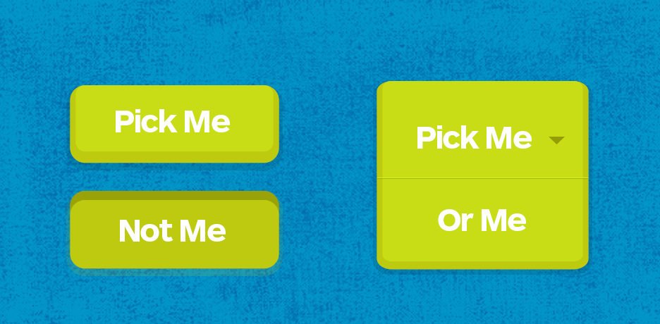
For a list of reciprocal and exclusive items, should you use radio buttons or a drop-down? Answer: It depends. Use radio buttons when the options underneath are not obvious. This allows users to see every option at the same time. If users understand the options underneath a drop-down, then they work very well.
For example, selecting a country requires a long list to choose from. A drop-down used in this example makes sense because the user can navigate through it with ease. The user will have natural expectations from other web experiences with the drop-down. They will assume the countries will be in alphabetical order. If the website base is from the United States, users will expect that it will most likely be the first list option.
Navigational Form Elements
Which form element do you use when the user is making a choice that will determine the next web page they see? Radio buttons may seem like the obvious choice. Yet, users will not expect radio buttons to perform an action (e.g. launch a new web page). So, regular buttons with proper labels are actually the best choice.
Default Radio Buttons
Do you have one radio button in a group selected by default? This is an interesting one. In a 2004 Alertbox, Nielsen recommended to always have a radio button selected by default. There are two benefits to not having a radio button selected:
- It won’t introduce any bias if you are doing a survey.
- Users will have to pay attention to the question (if required).
The drawback of not selecting an option by default is that it may take more time for a user to fill out a form. Select a radio button by default if there are frequent responses to a question and/or a lot of user inquires.
There are so many other unique situations to list here. Contact us to collaborate on more strategic web projects.


